Overview
Background
For most partygoers, a fun and memorable night out is very dependent on the music and vibe. Although these are influential factors, they’re often indeterminable until arriving at the venue/scene. We decided to change that.
Role
Interviews
Logo Design
Low-Fi Wireframes
User Flow
Sketches
Summary
Problem
For most partygoers, a fun and memorable night out is very dependent on the music and vibe. Although these are influential factors, they’re often indeterminable until arriving at the venue/scene.
Solution
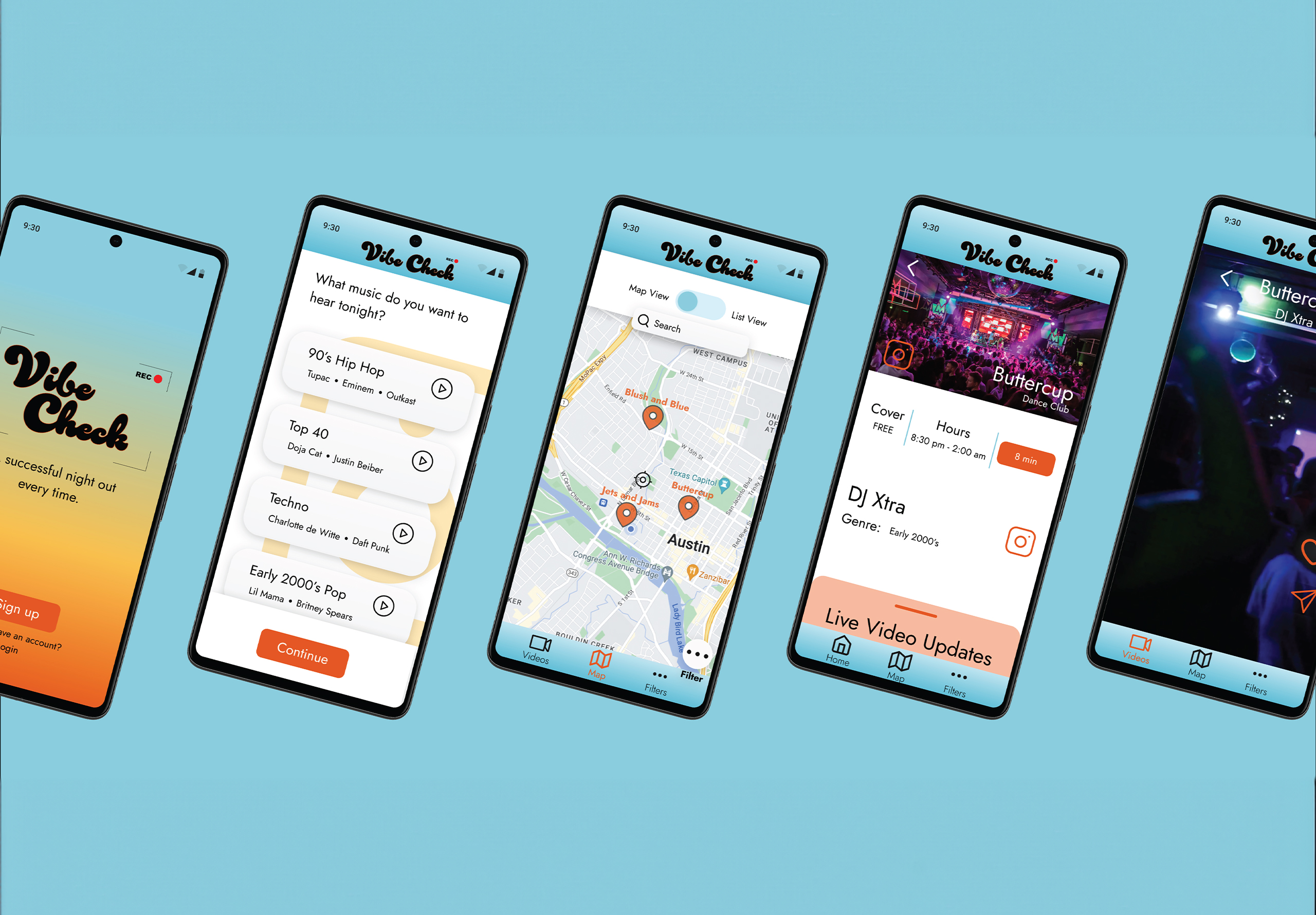
An app that allows partygoers to preview DJs and music genres at various local clubs through the use of video and real-time updates.
Impact
Increased the rate of efficiency by 1 minute and 8 seconds after implementing usability testing feedback.
Research
Interview Takeaways
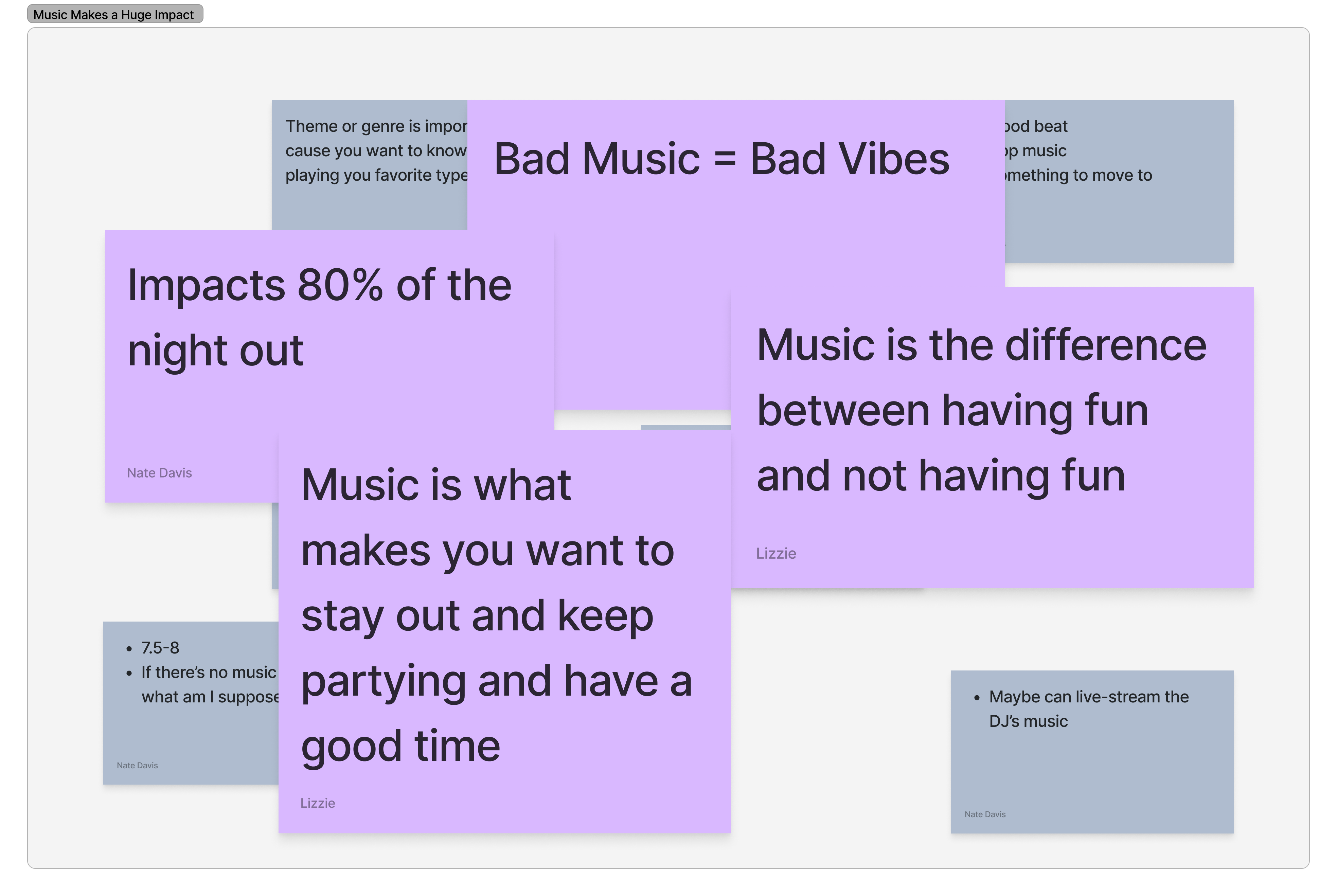
- Music makes a huge impact.
- People care less about who the DJ is and more about how they are performing in real time.
- Music, vibe, and the crowd are the biggest factors for a successful night out.
Survey Takeaways
- Music greatly affects a night out.
- Paying a cover cost affects how people decide where to go.
- Live videos are a great way to help people decide on a venue.
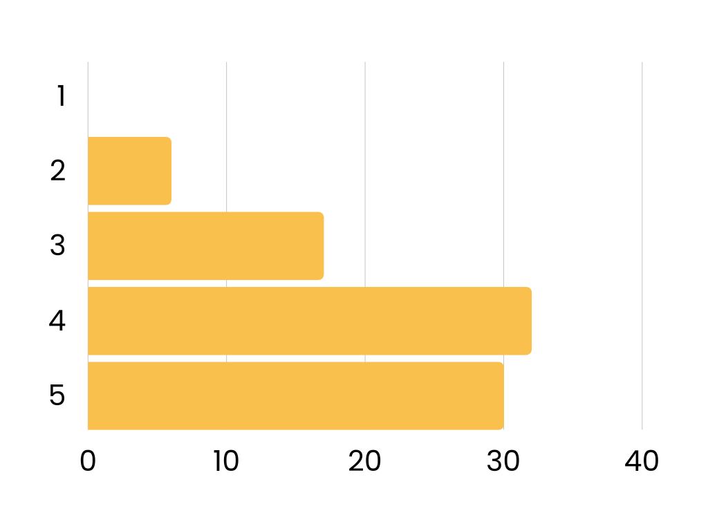
Problem Identified
PROBLEM
For most partygoers, a fun and memorable night out is very dependent on the music and vibe. Although these are influential factors, they’re often indeterminable until arriving at the venue/scene.
Analysis
How Might We
- Give party-goers a better understanding of the vibe and music playing at various local bars and clubs ahead of time?
- Help users ensure their night out will be a success?
- Make finding a good bar more convenient and safe for our users?
Competitor Analysis
There are many social focused and bar-related apps, but none of them offered all the same features Vibe Check offers.

User Persona
For someone focused on learning about local bars, we decided to make our user persona someone who’s new to the city but ready to explore.

Solution Identified
SOLUTION
An app that allows partygoers to preview DJs and music genres at various local clubs through the use of video and real-time updates.
Creation
User Path
Lorem ipsum dolor sit amet, at mei dolore tritani repudiandae. In his nemore temporibus consequuntur, vim ad prima vivendum consetetur. Viderer feugiat at pro, mea aperiam
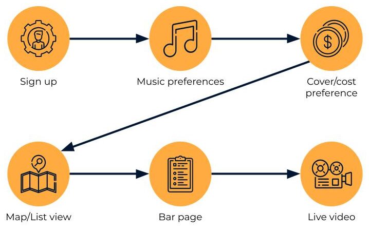
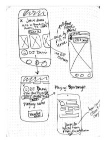
Sketches
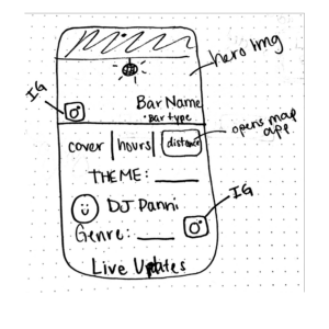
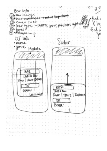
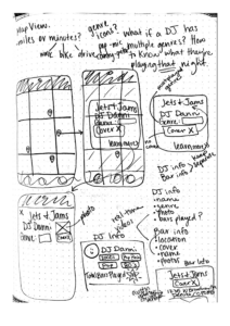
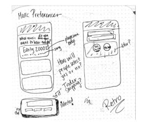
A/B Testing
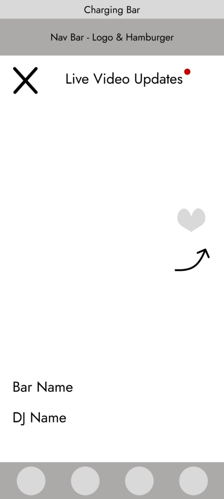
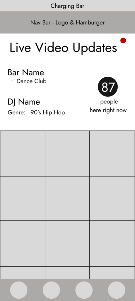
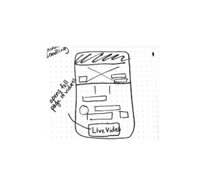
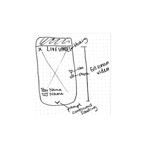
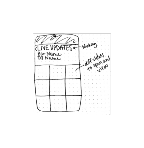
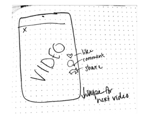
Our goal was to see how users preferred to view the live videos: continuous scrolling or gallery view. Our users were evenly split down the middle, so we ended up offering both versions similar to Instagram’s layout.
UI Style Guide

Final Results

Impact Achieved
IMPACT
Increased the rate of efficiency by 1 minute and 8 seconds after implementing usability testing feedback.


