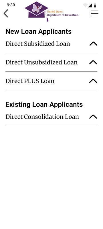
Overview
Background
With my background in education, I have a passion for making education both accessible and empowering. The U.S. Department of Education is a reputable resource for all types of students and faculty, yet their website was getting in the way. I decided to change that.
Role
Research
Creative Direction
UI Design
Logo Design
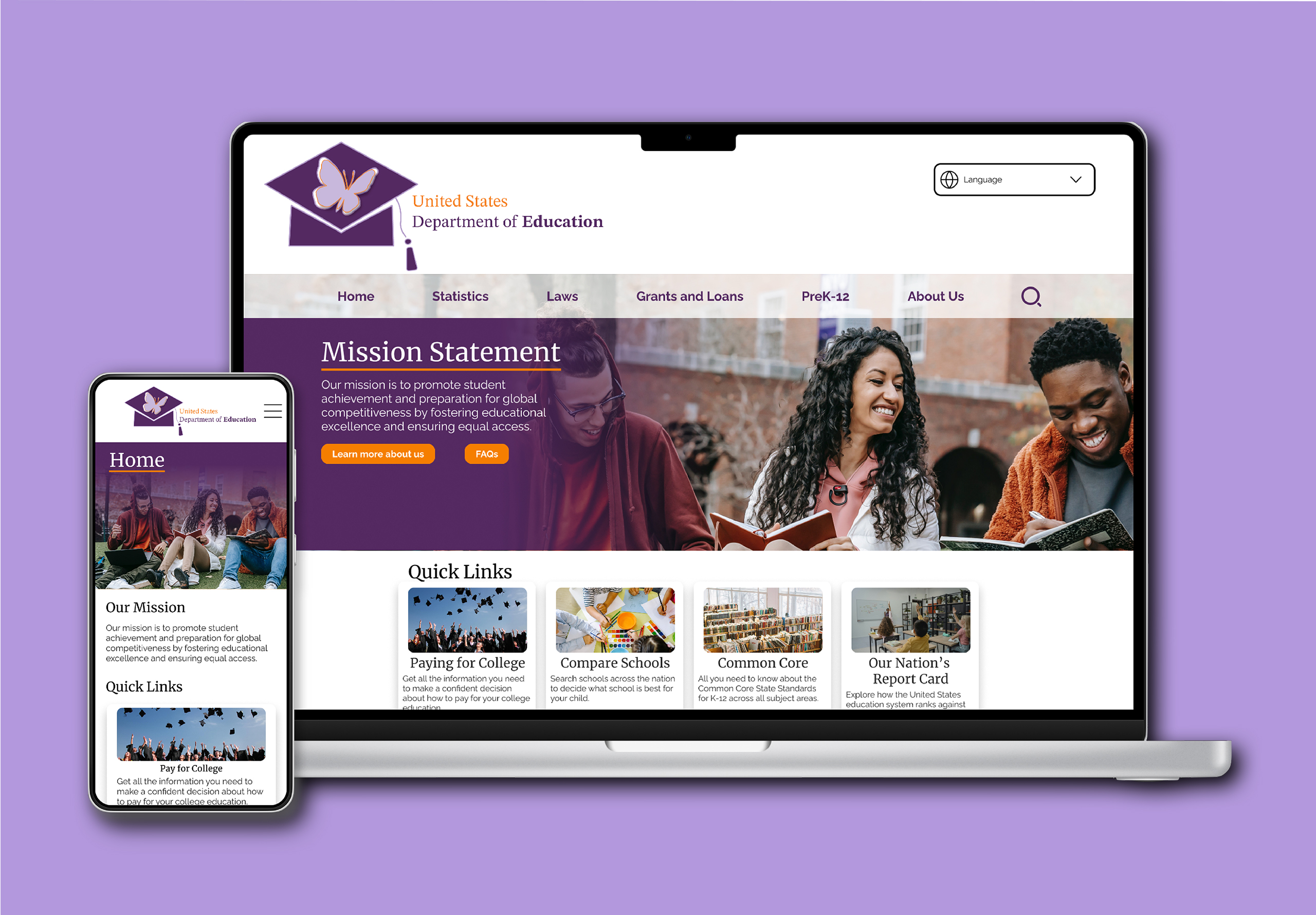
Summary
Problem
The current DOE site makes it hard for college students to access vital information about grants and loans because of unclear language and messy informational architecture.
Solution
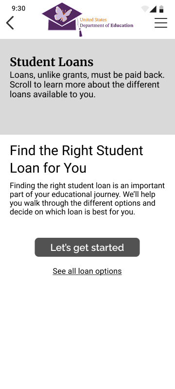
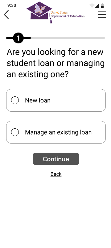
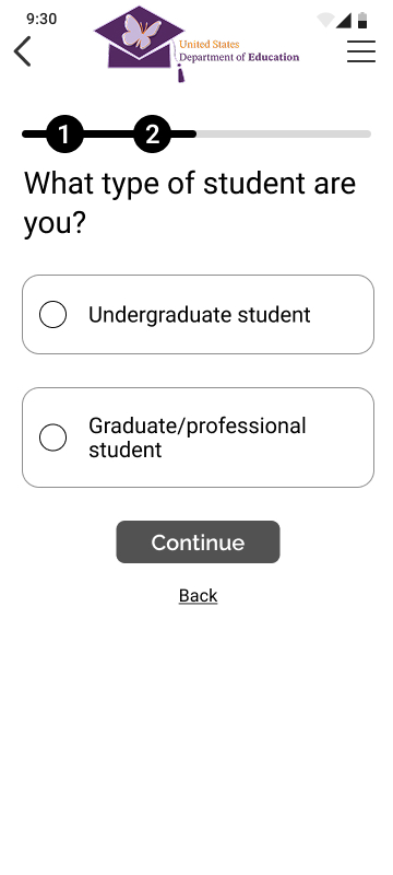
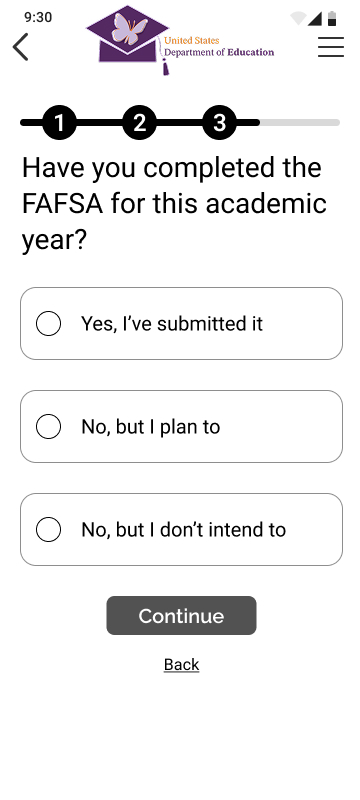
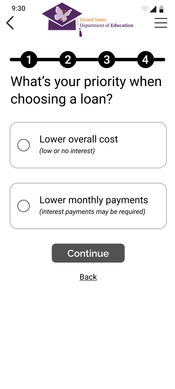
Create a student loan wizard/walk-through to help users determine which loan is right for them.
Impact
Simplified the process of applying for a student loan and educated the user along the way.
Research
Interview Takeaways
People visit the U.S. Department of Education (DOE) website because it is reputable and important, but the site makes users feel overwhelmed.
What are the main reasons someone would use the DOE website?
What’s your first impression when you look at the DOE website?
Audit
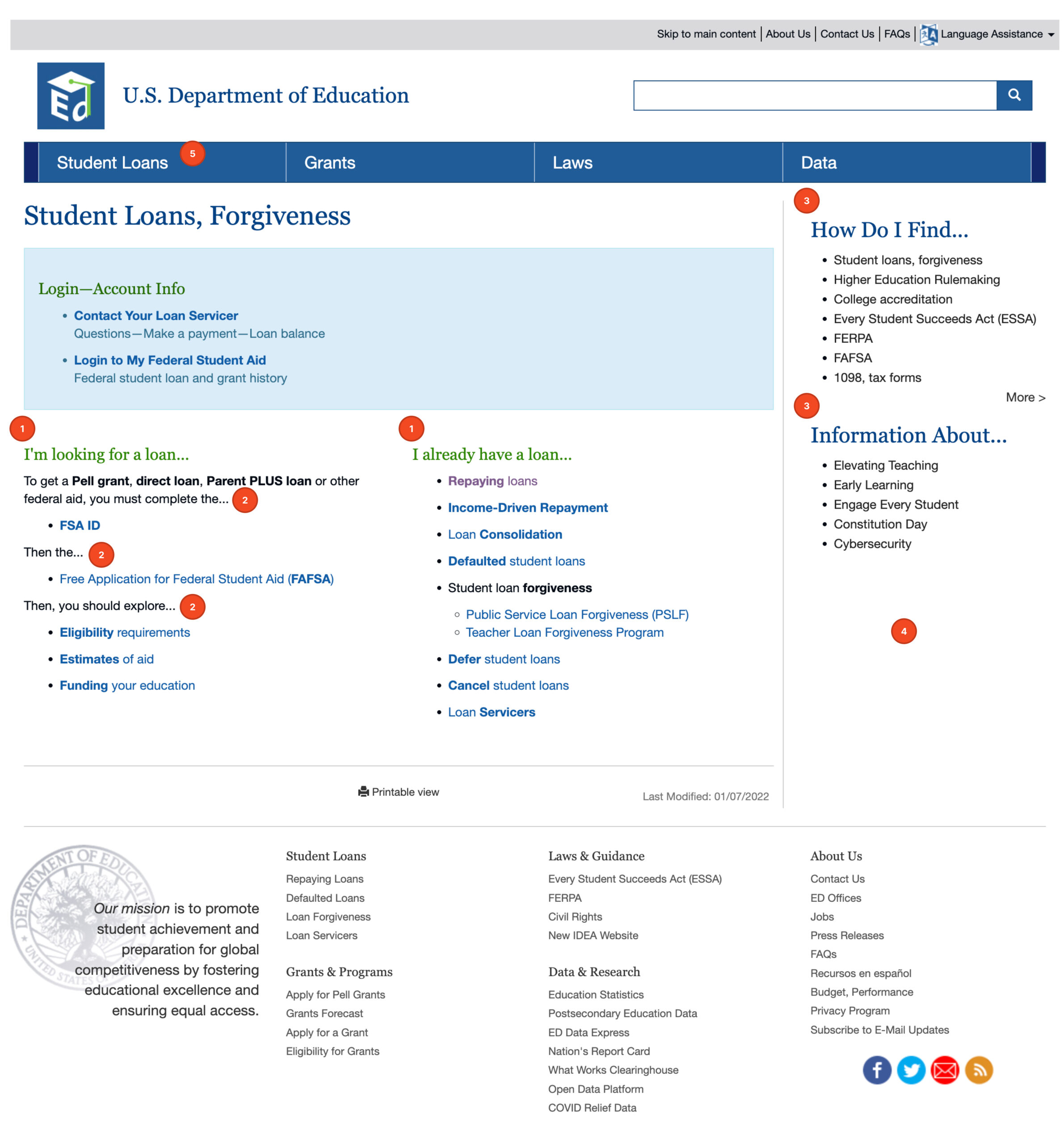
Before jumping into solutions, I wanted to get familiar with the baseline I’d be working from. I conducted an audit of the current DOE site and came up with some overarching UX/UI weaknesses.
- Difficult navigation
- Unclear language
- Poor informational architecture
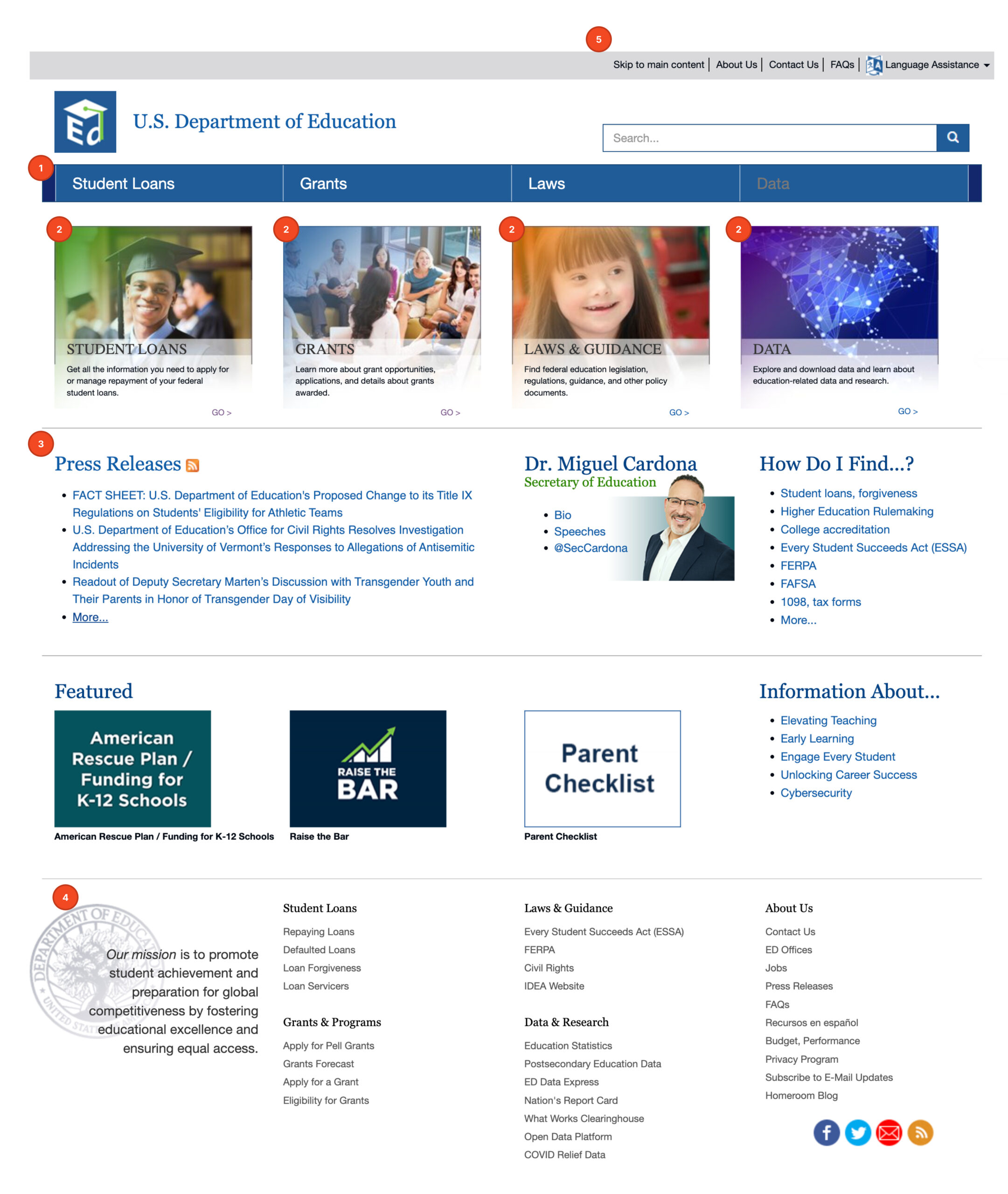
Home Page
- Add home page to navigation bar
- Make primary content more eye catching
- Reduce unnecessary links
- Give the mission statement more prominence
- Get rid of additional nav bar
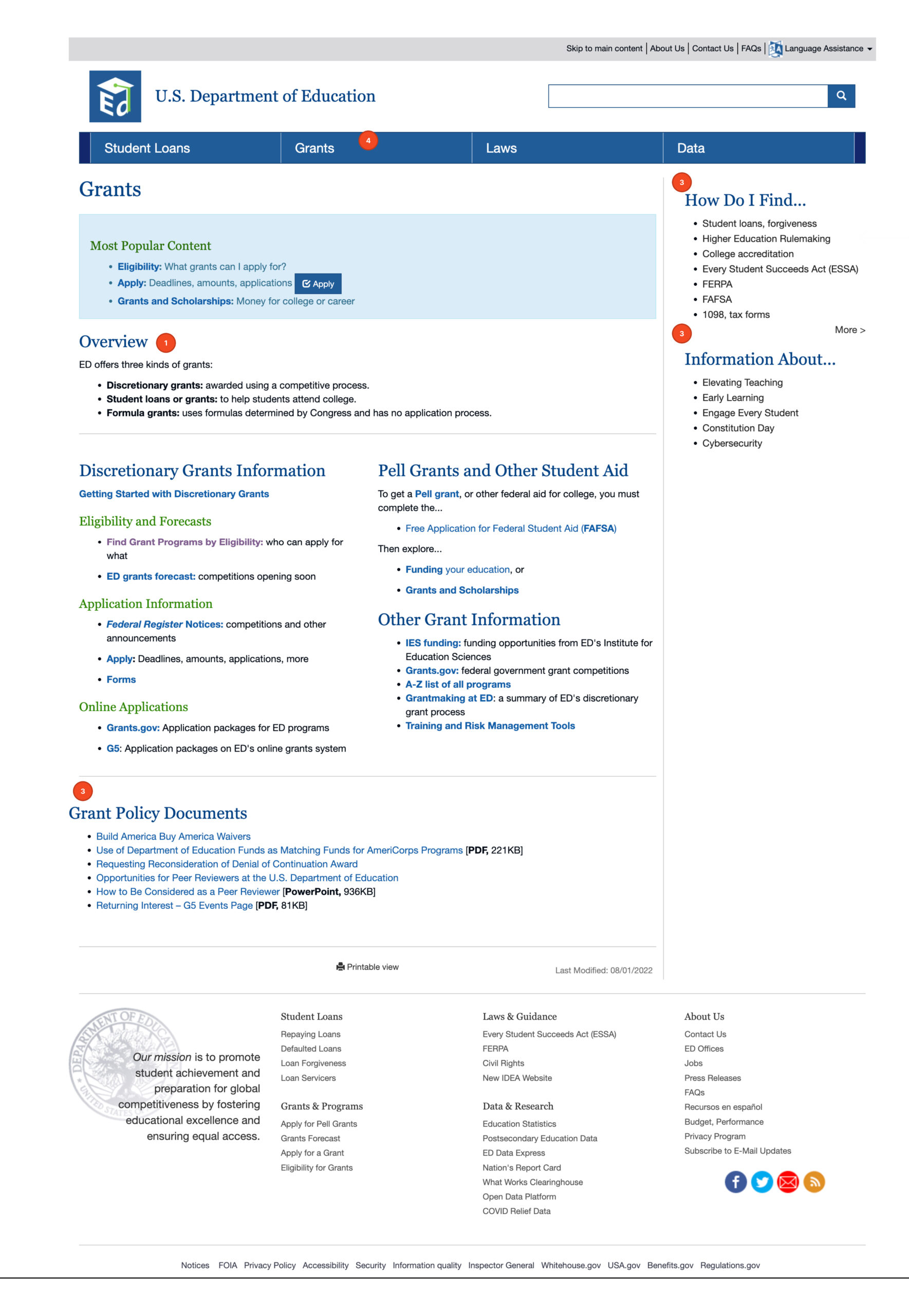
Grant Page
- Emphasize the overview
- Move student aid info to student loan page
- Reduce unnecessary links
- Reiterate the difference between grants and loans
Student Loan Page
- Emphasize the main options
- Clarify the step-by-step instructions (graphic)
- Reduce unnecessary links
- Add more photography & visual elements
- Reiterate the difference between loans and grants
Problem Identified
PROBLEM
The current DOE site makes it hard for college students to access vital information about grants and loans because of unclear language and messy informational architecture.
Analysis
How Might We
- Improve the informational architecture to make navigation seamless?
- Update copywriting to be educational, inclusive, and inviting?
- Create a user interface that is fun yet inspirational?
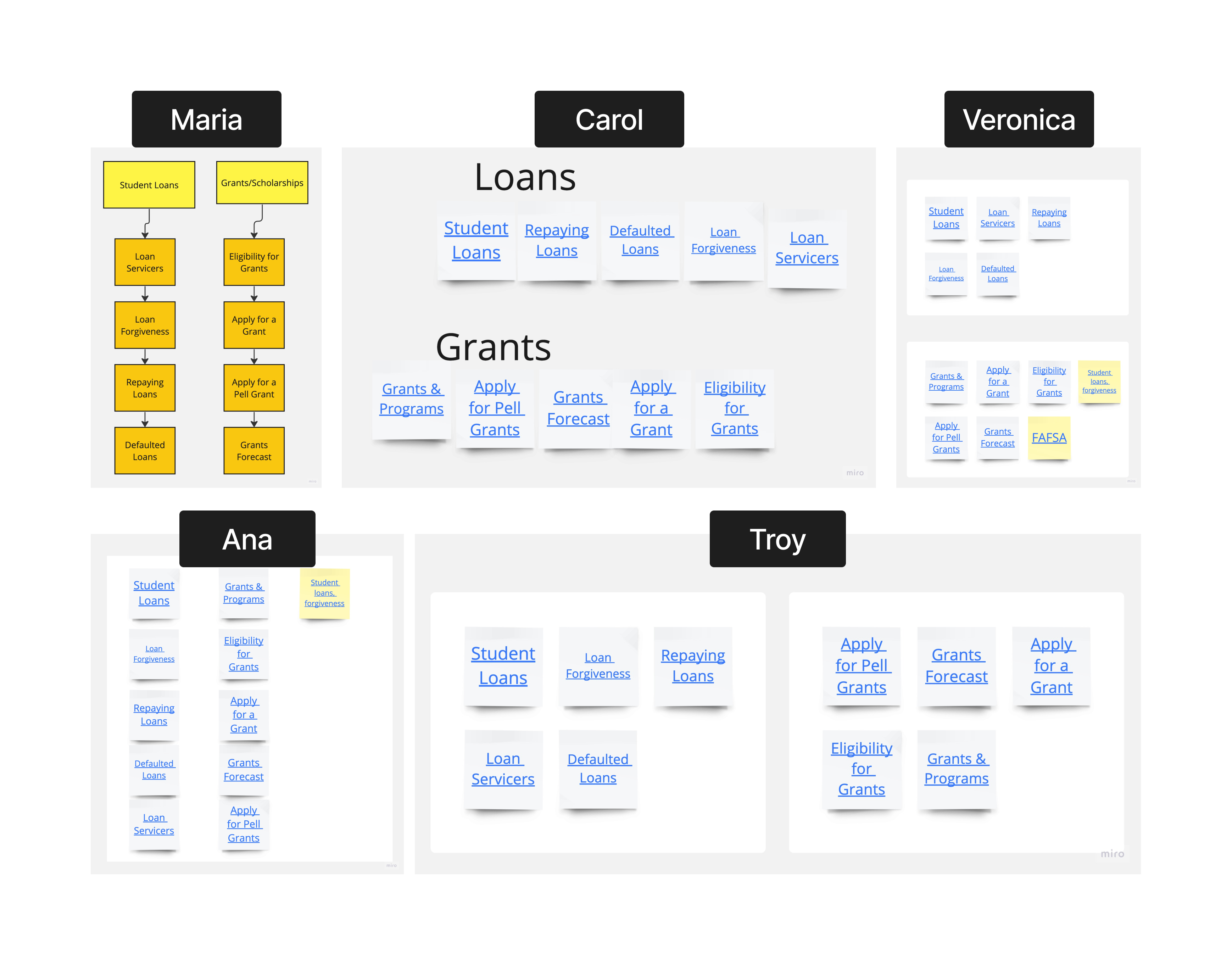
Card Sorting
Participants knew grants and loans were similar yet different. They determined, based on their sorting, that grants and loans should be near each other because they are associated but separated because they have distinct differences.
- 4/5 participants sorted grants and loans into separate groups
- 100% of participants placed grants and loans in an overarching category together
User Persona
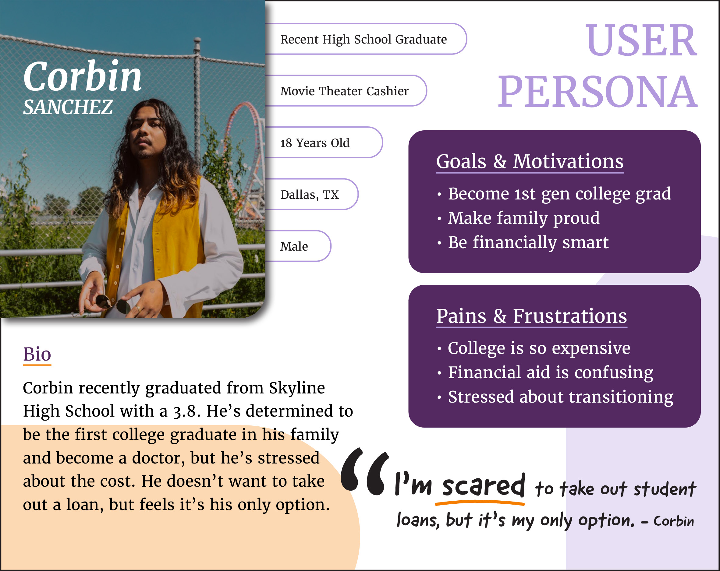
The goal here is to help college students navigate information on how to pay for college, so I chose a first generation student who might need more support than usual.
Solution Identified
SOLUTION
Create a student loan wizard/walk-through to help users determine which loan is right for them.
Creation
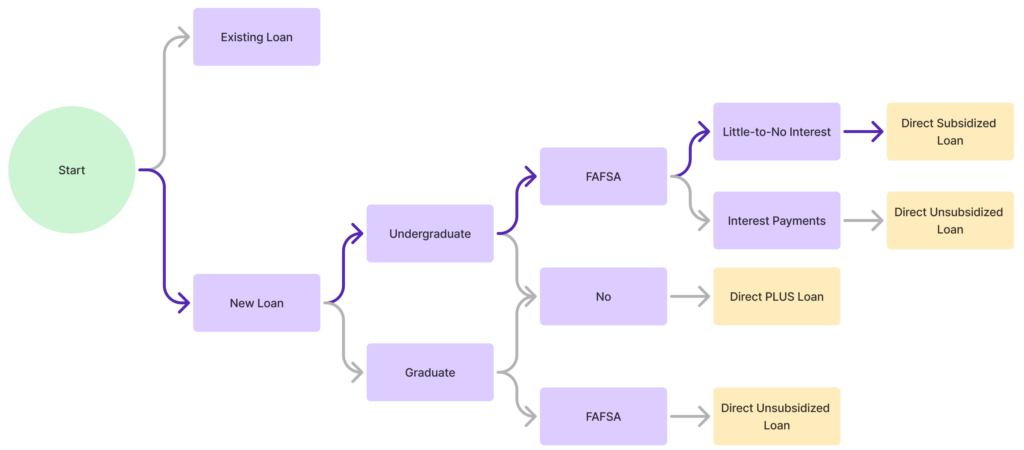
User Path
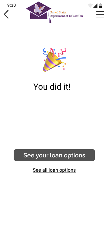
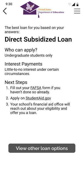
There are many ways to pay for college, but based on my research, the most common is through a Direct Subsidized Loan. With that in mind, the following solution is focused on getting the user through the wizard/walk-through to the Direct Subsidized Loan information page.
Sketches
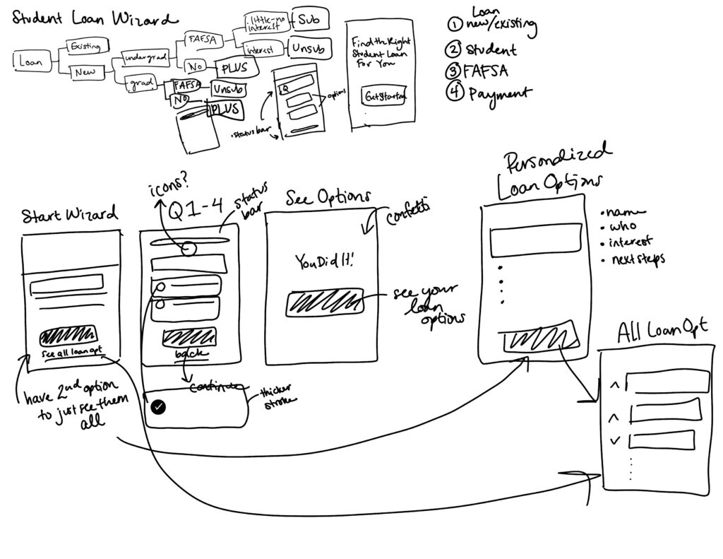
Wireflow
UI Style Guide
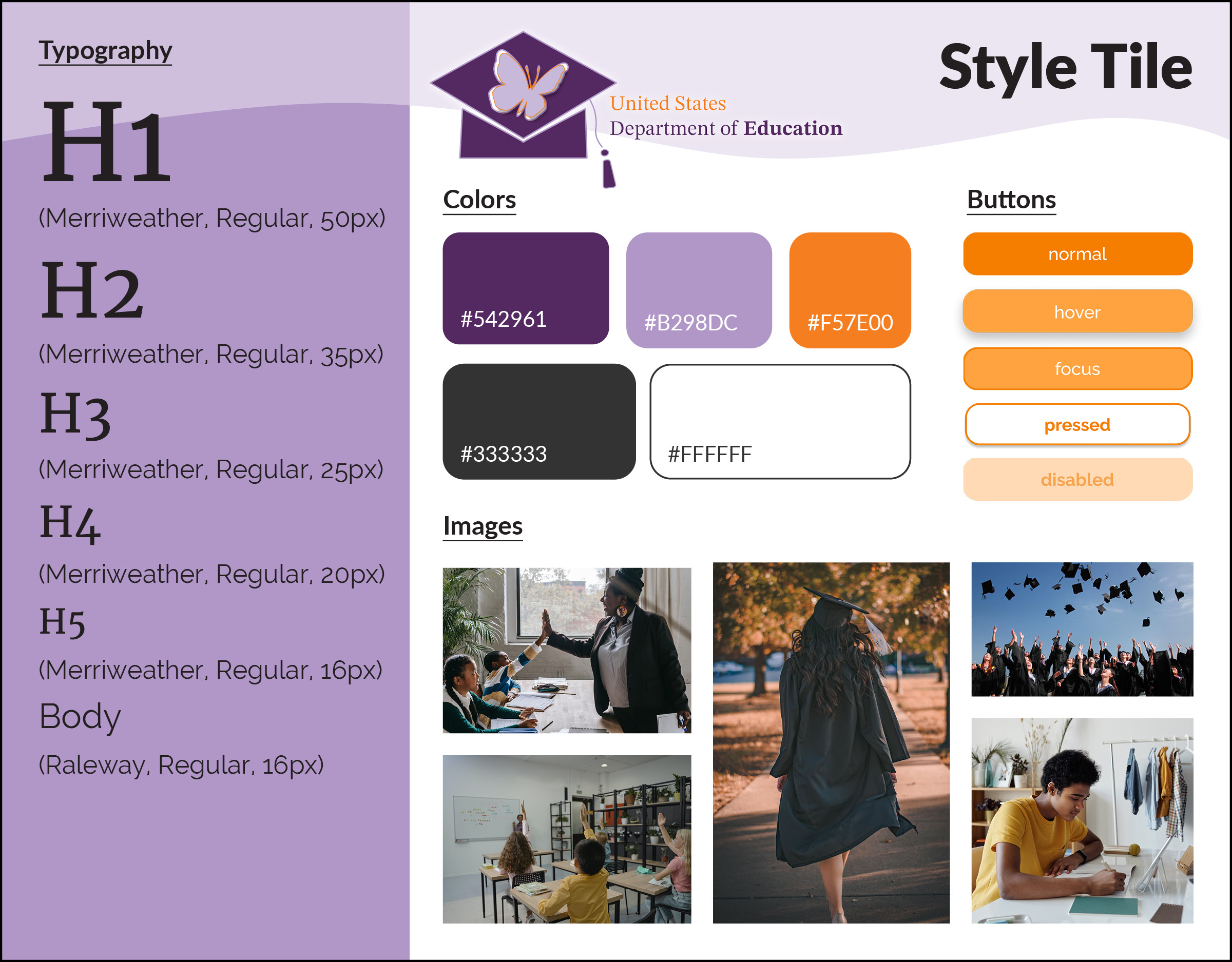
Education takes on many forms, so I challenged myself to lean into the complexity. My goal was to create a space where serious academia meets playful inspiration.
The purple represents royalty and the serious academia side of education. It also doubles as an equal representation of U.S. politics because due to the 10th amendment, education is primarily run by the state, not the federal government.
The orange added a fun contrast as it represents energy, excitement, and adventure. It’s a reminder that education should be playful and inspiring.
Lastly, I chose the butterfly to represent transformation and change. Education is so powerful as it can open so many doors for so many people. I wanted users to feel excited about their journey the second they visited the site.
Final Results
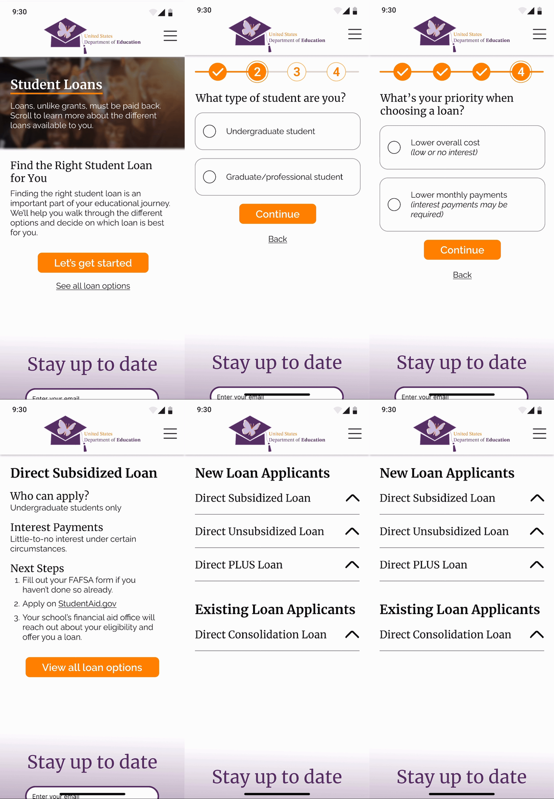
Impact Achieved
IMPACT
Simplified the process of applying for a student loan and educated the user along the way.

