Overview
Background
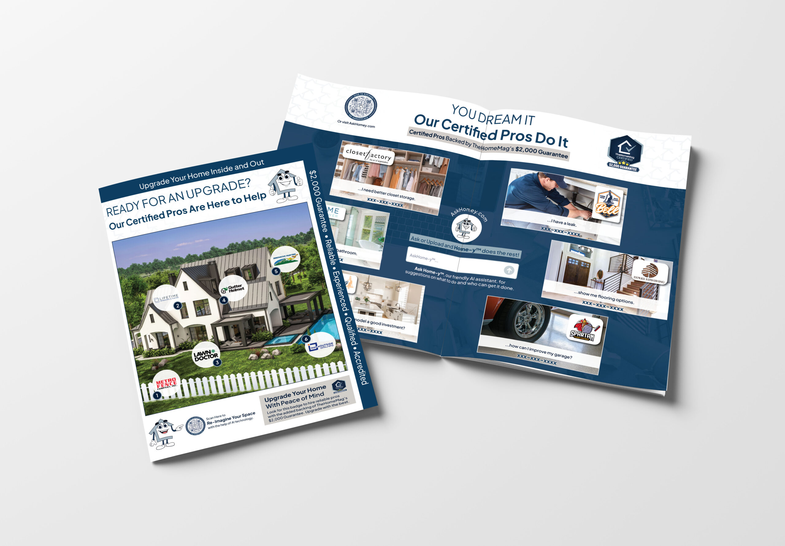
TheHomeMag recently launched their first online presence via AskHomey.com. We wanted to both advertise our new platform and increase overall leads for our clients signed up as Certified Pros.
Role
Creative Direction
Lead Designer
Client Management
Preflighting
Proofreading
Copywriting
Summary
Problem
A large client pulled back on their advertising, and a new digital product was launched but wasn’t getting the attention it deserved.
Solution
Create a new off page product to grow revenue across multiple clients all while pushing for more engagement for the new digital marketing platform.
Impact
Set to increase sales by $2.5 million year over year.
Brainstorming
Key Elements
The main idea for this piece came from a newspaper clipping. While creating the product, we knew we wanted these elements:
- Double Sided
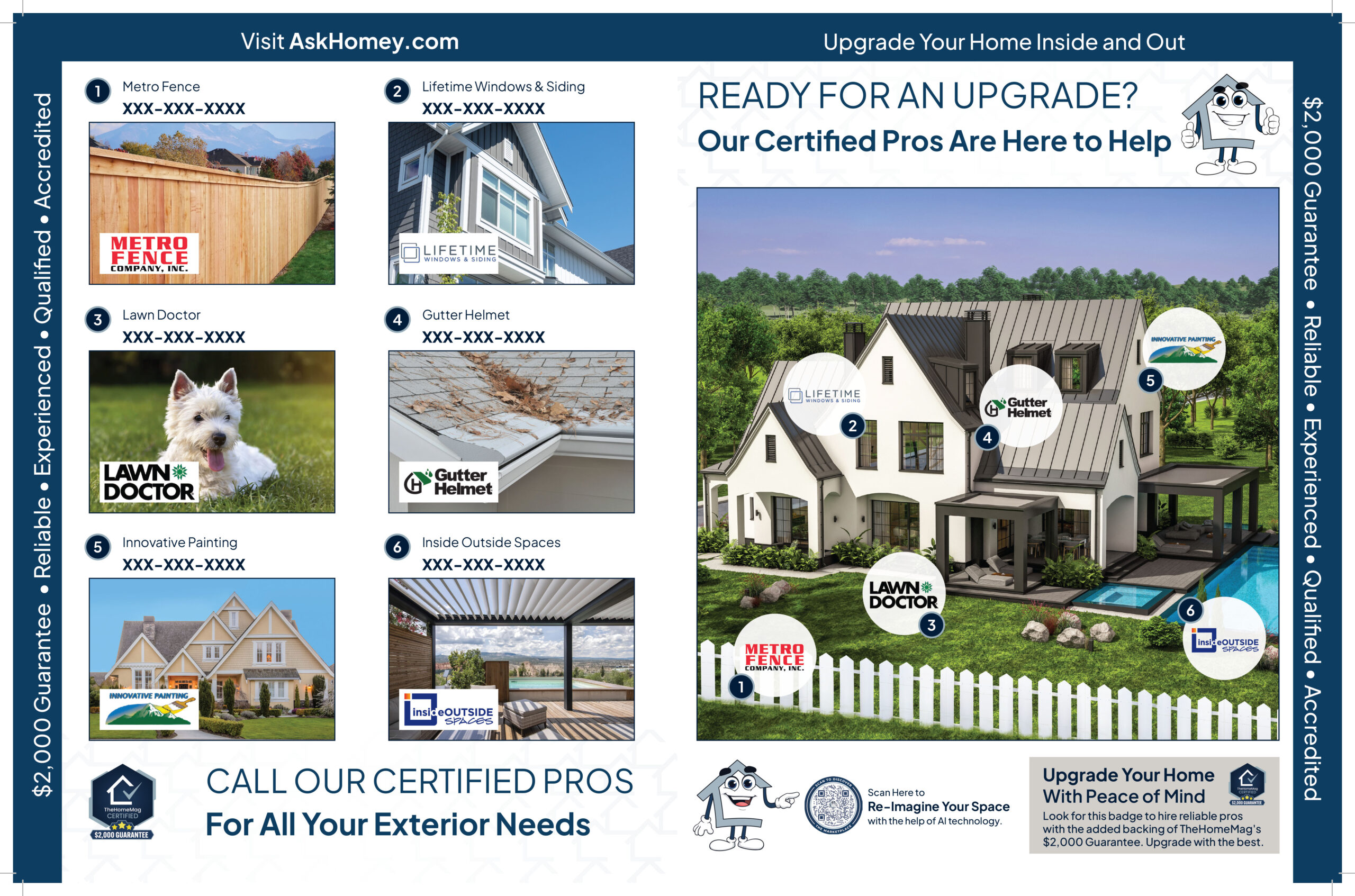
- Front: exterior home remodeling clients
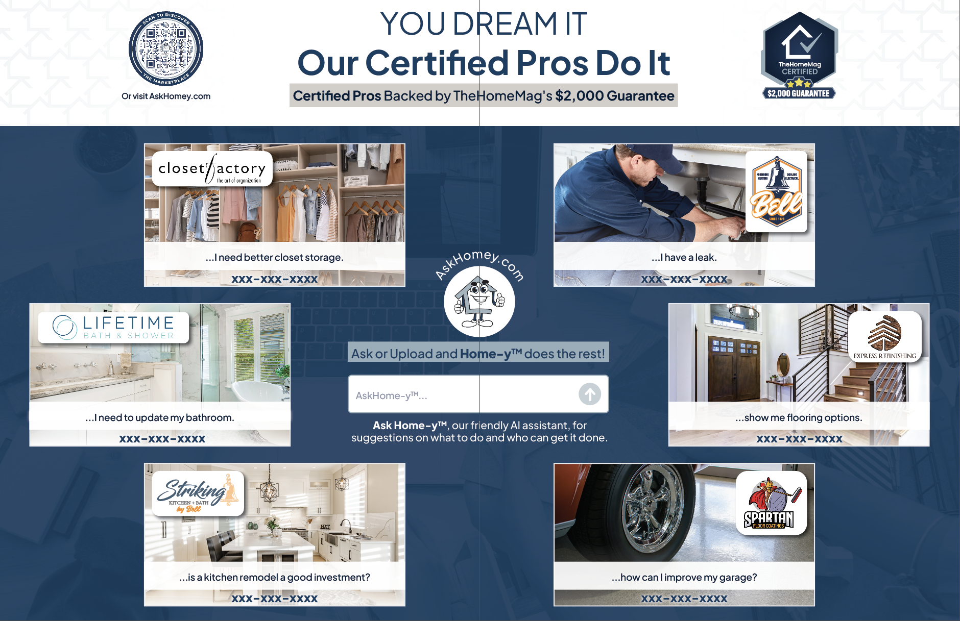
- Back: interior home remodeling clients
- 12 Clients Total
- Educational
- Help readers understand the new digital marketing platform: AskHomey.com
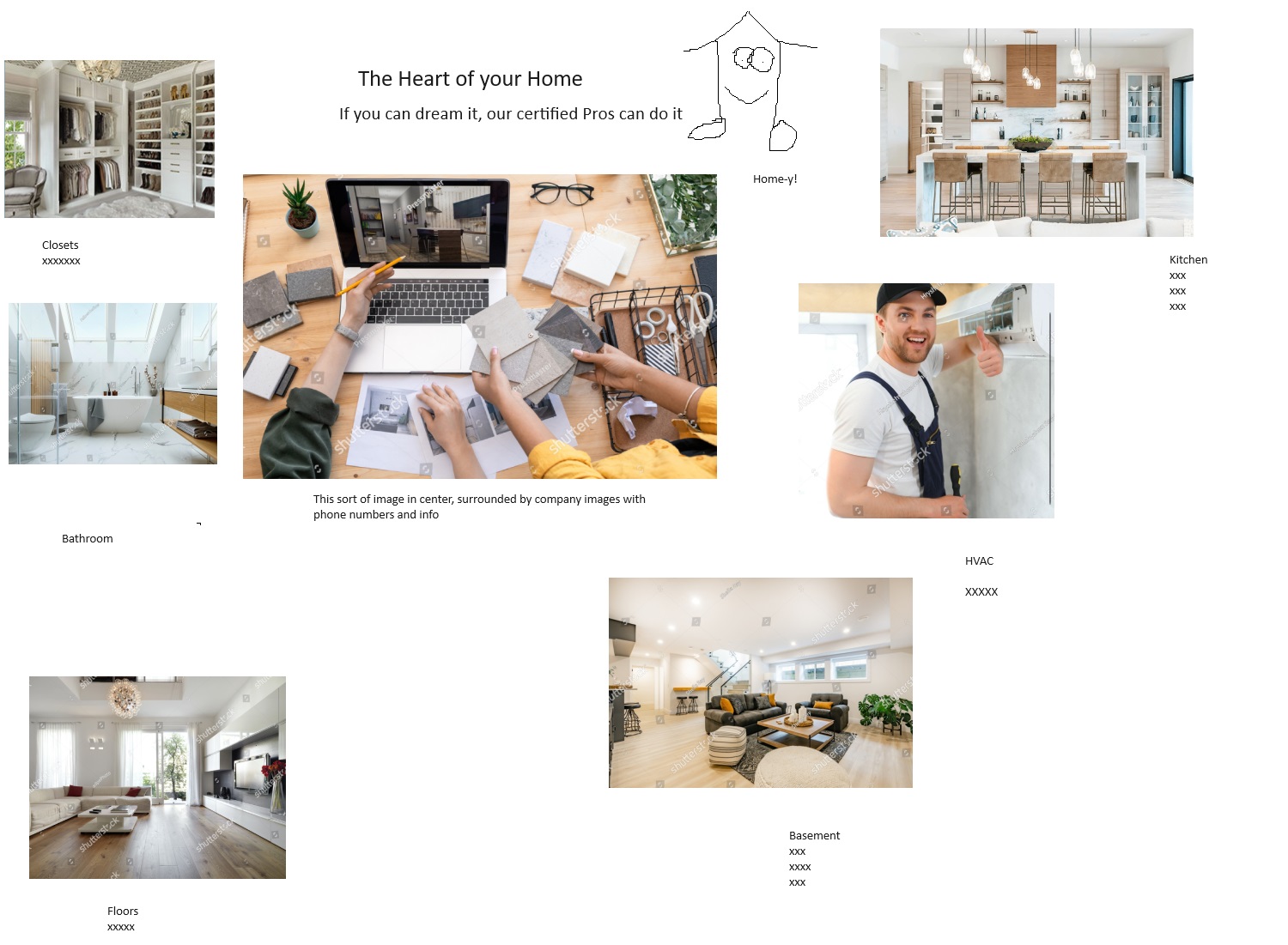
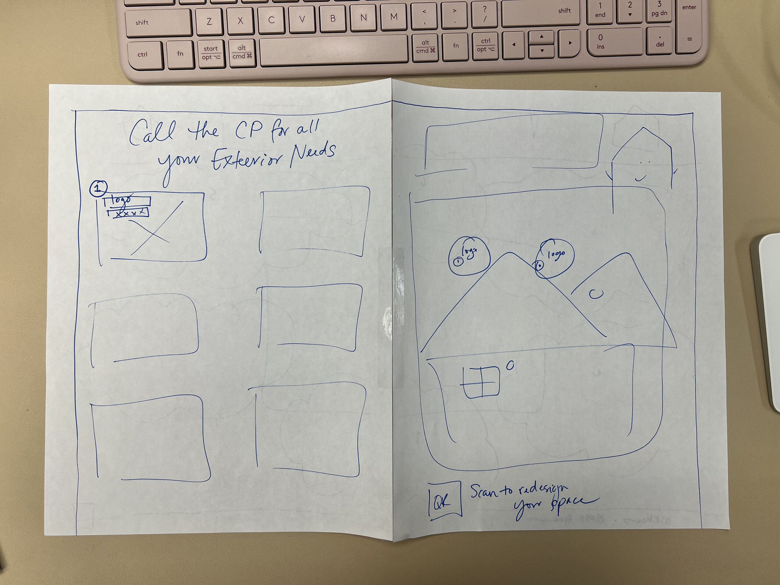
First Iteration
There was a lot of back and forth for this new product. To sum up the overall feedback, the publisher wanted:
- More client visibility
- Larger logos
- Larger project images
- Clean and legible
- More educational information about the new digital marketing platform
Problem Identified
Problem
A large client pulled back on their advertising, and a new digital product was launched but wasn’t getting the attention it deserved.
Iterating
Inital Feedback
There was a lot of back and forth for this new product. To sum up the overall feedback, the publisher wanted:
- More client visibility Larger logos
- Larger project images
- Larger logos
- Clean and legible
- More educational information about the new digital marketing platform
Interior Page
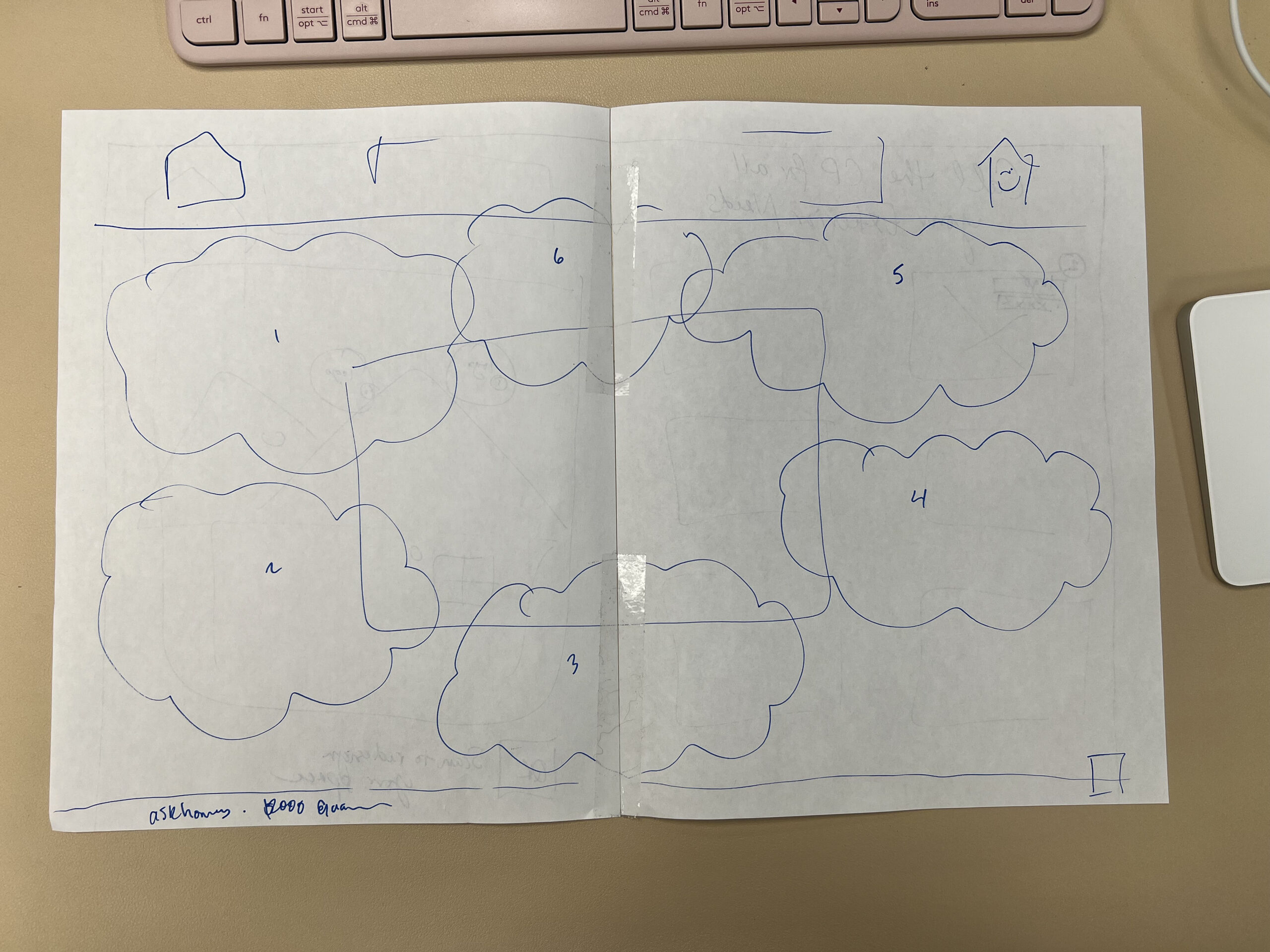
The interior (back) page proved to be the most challenging when it came to spacing and accommodating the requests above.
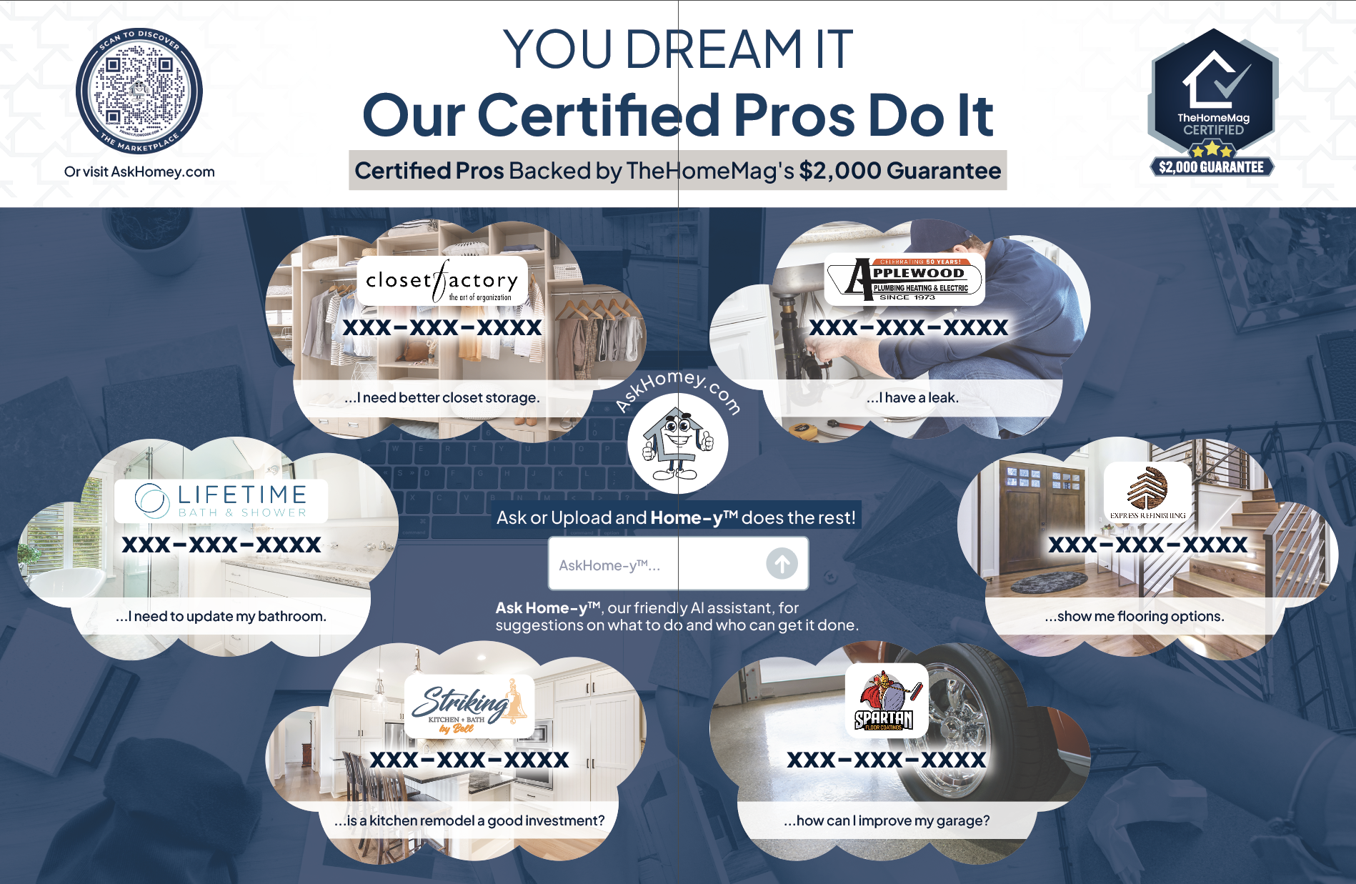


The publisher wanted the Interior page to play off the “You Dream It, We Do It” concept with cloud-like shapes. We tried a variety of ways to fit all the content, but the obscure shapes were getting in the way of the piece more than they were promoting the vision, so I suggested a clean look similar to the front. This also helped create more space for the educational aspects.
And the team loved it.
Solution Identified
Solution
Create a new off page product to grow revenue across multiple clients all while pushing for more engagement for the new digital marketing platform.
Final Results

Impact Achieved
IMPACT
Set to increase sales by $2.5 million year over year.


